Role
This was a group project (2 people) - I took on a major role in the branding: Logos, colours, type, packaging, pitch document, and we collaborated on the new copy, and social media marketing.
Applications Used
Illustrator, FigJam, ProCreate, Adobe Express
Overview
This project was created for my graphic design project class. We were tasked with a complete re-haul in branding, so completely new messaging, copy, and goals which were the basis for the brand re-design. Our focus in the project was to take a roastery/cafe that was currently marketed towards older people and re-design it so it is targeted towards Gen-Z. We feel they could be very successful if they were to target a younger audience as their coffee is sold on campus and they have an e-commerce business, so students don't have to travel to shop
Problem
Baden’s branding is out of date and due to its beige/brown colour palette it sort of blends into the background. It doesn’t standout on a shelf or in on a to go cup in the hands of university students. I didn’t even realize this was the coffee I drank all throughout first year
HOW MIGHT WE: Bring a younger audience to Baden Coffee
Our Goals
- increase brand awareness and engagement with a younger audience
- create a brand that people can identify with
- people feel cool holding out to go cup
Brand Critique - Cohesion and Versatility Issues
We began the rebrand process with an initial branding audit and critique. Here we found numerous issues mainly surrounding cohesive and versatility of the current branding which could lead to comprehension and recognition issues. This process allowed us to think about where people are seeing the brand and think of ways we could portray Baden better in different environments .
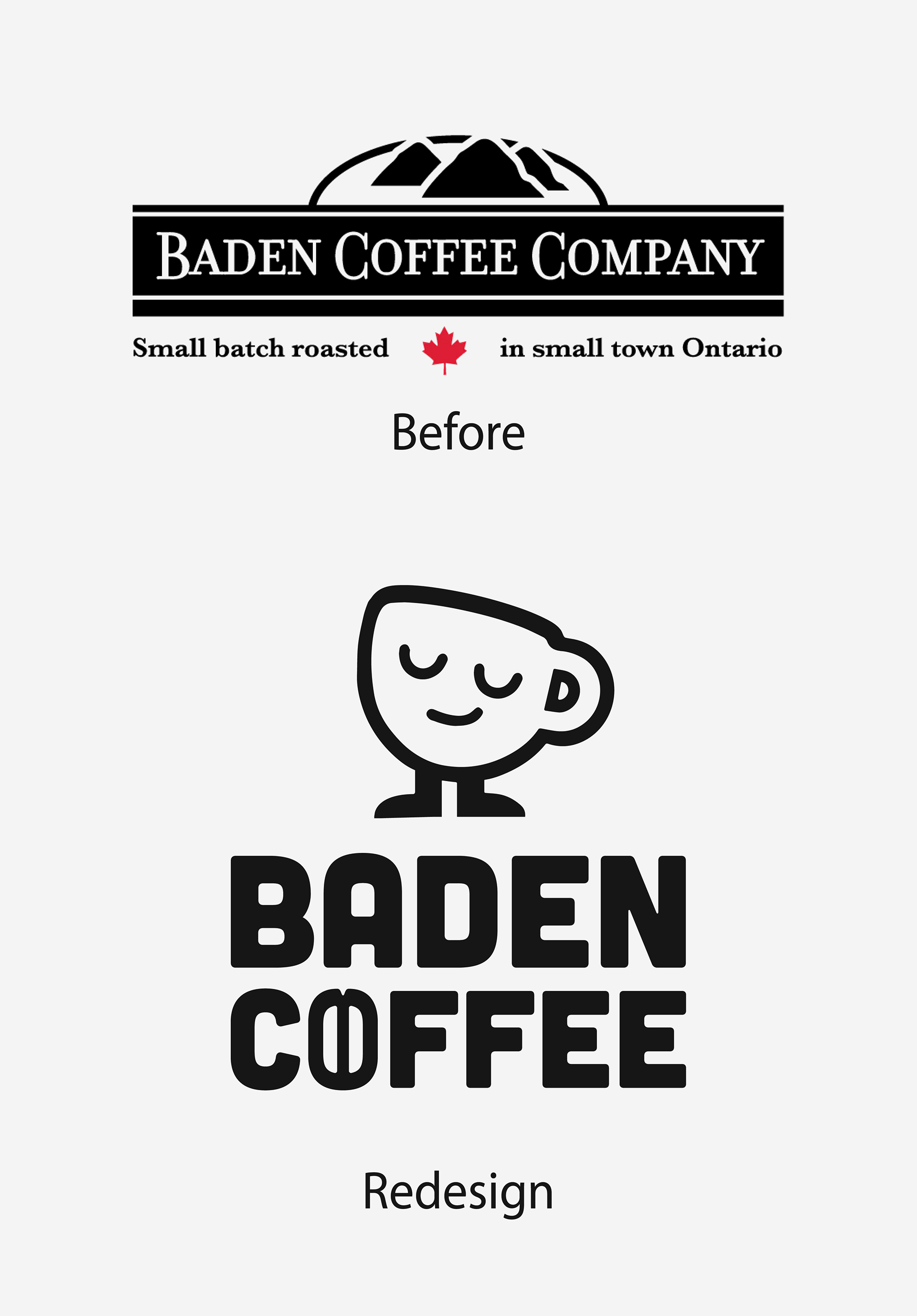
Logos - Their logo is not scalable or versatile as there are no no sub-marks. Additionally, through research the mountains in their logo probably relate to the origins of coffee but does not feel personal to the brand.
Brand identity - There was no cohesion of use of colours except for brown, white and black throughout their various outlets such as social media or web. In general their current branding was very outdated and not cohesive.
BeanTown Cafe vs Baden Coffee - It is not clearly stated that these two aspects of their brand are different unless you do some digging or are on their website, making it hard to differentiate the two or know what to search when trying to find the cafe.
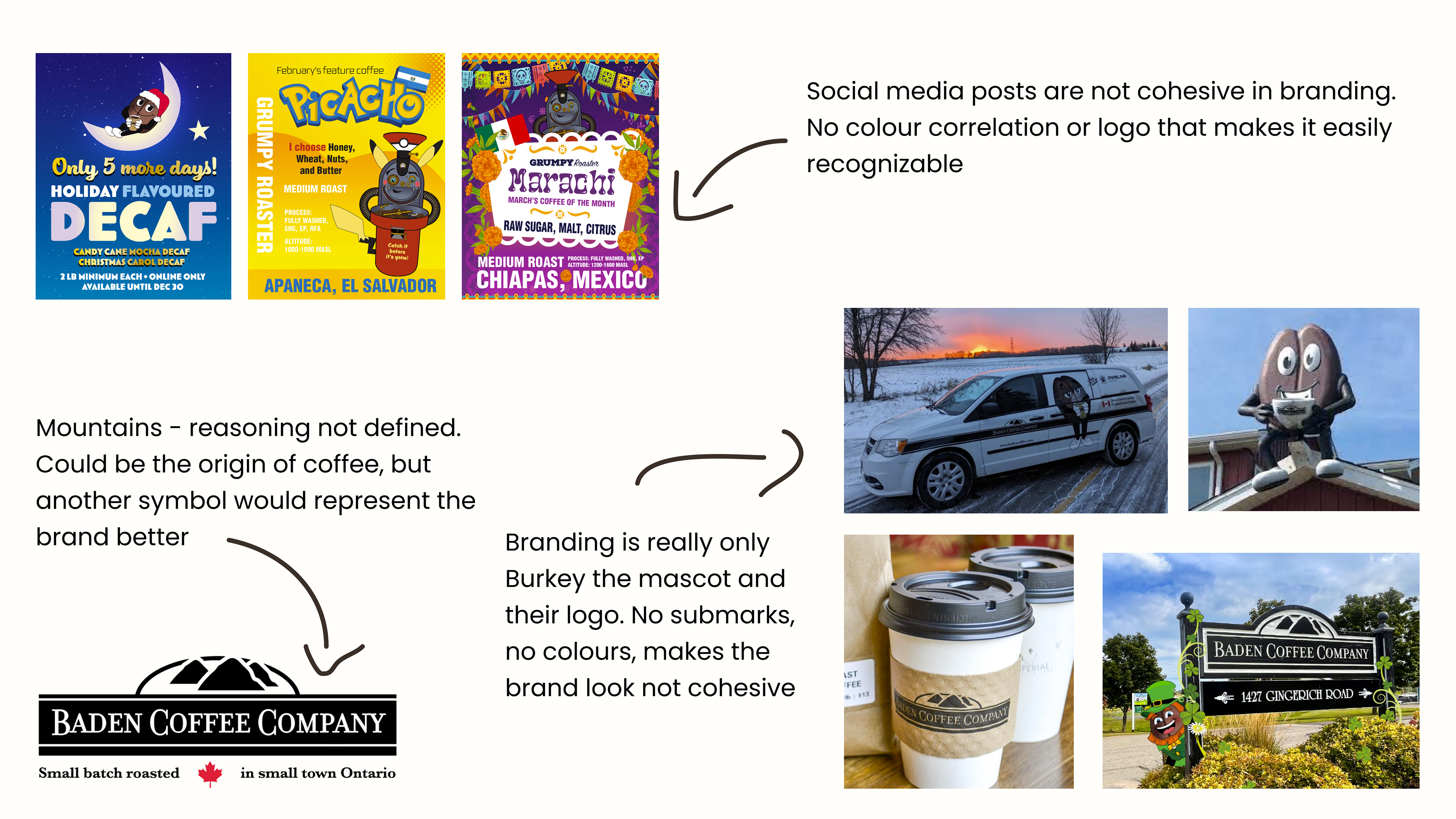
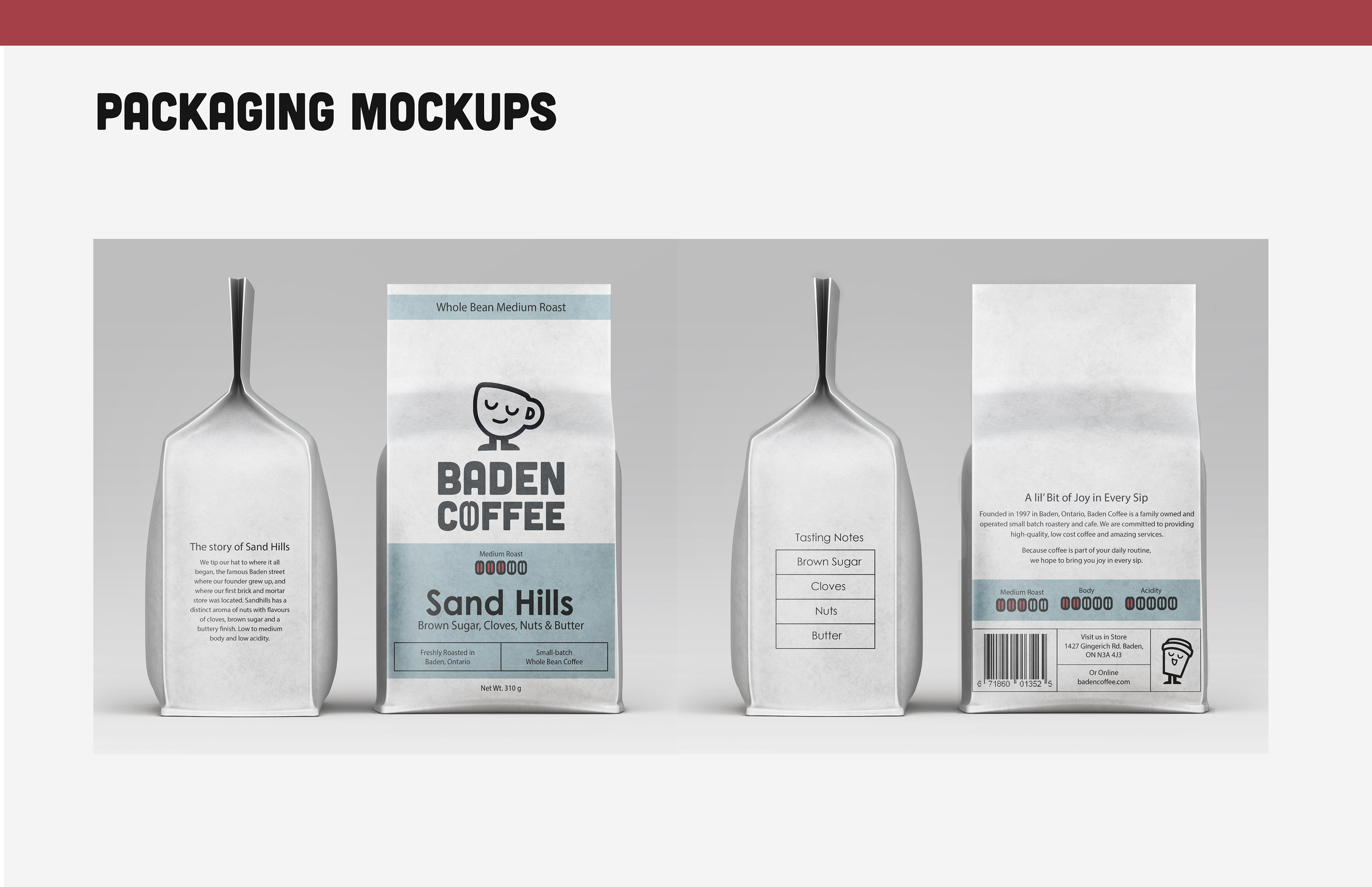
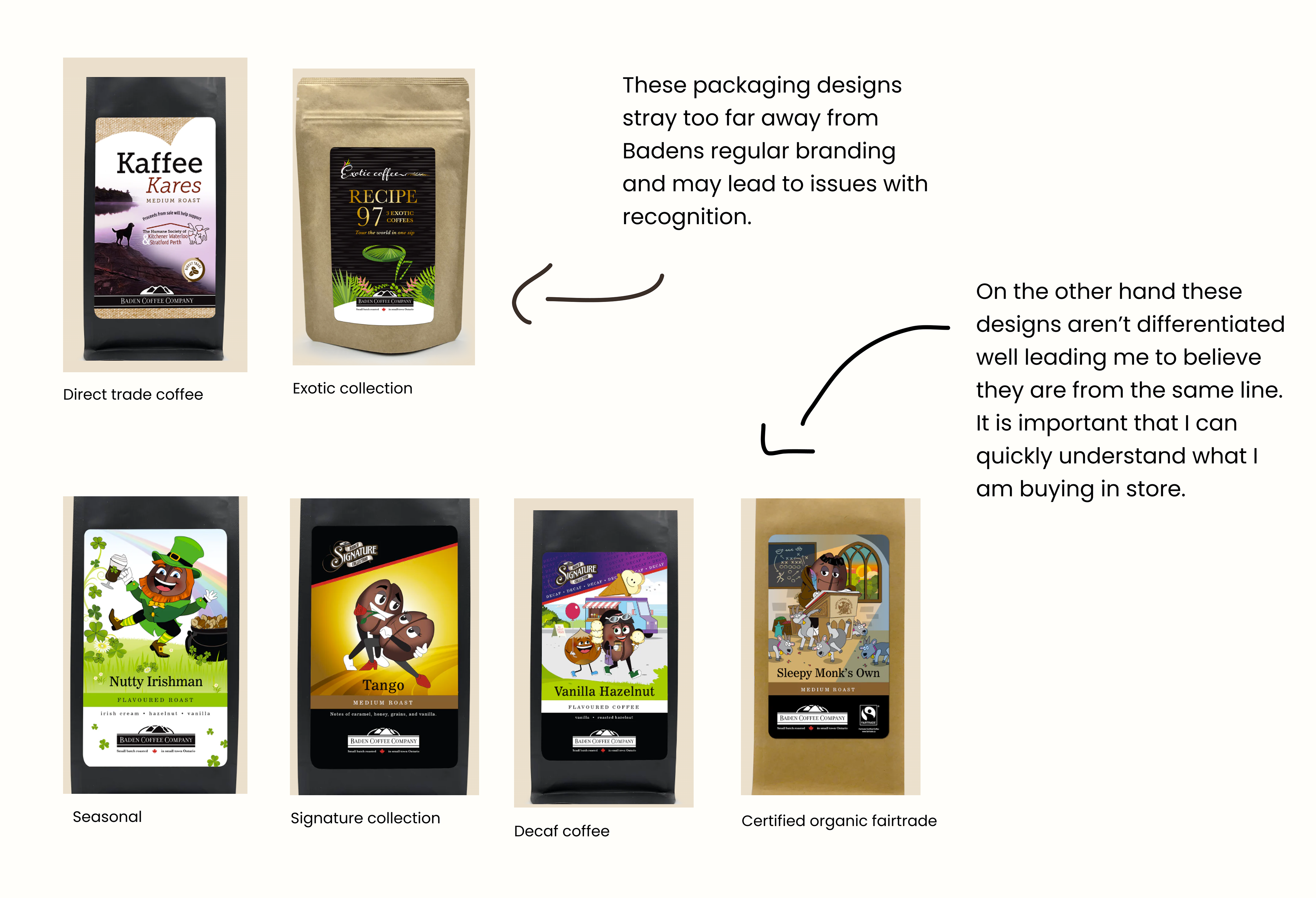
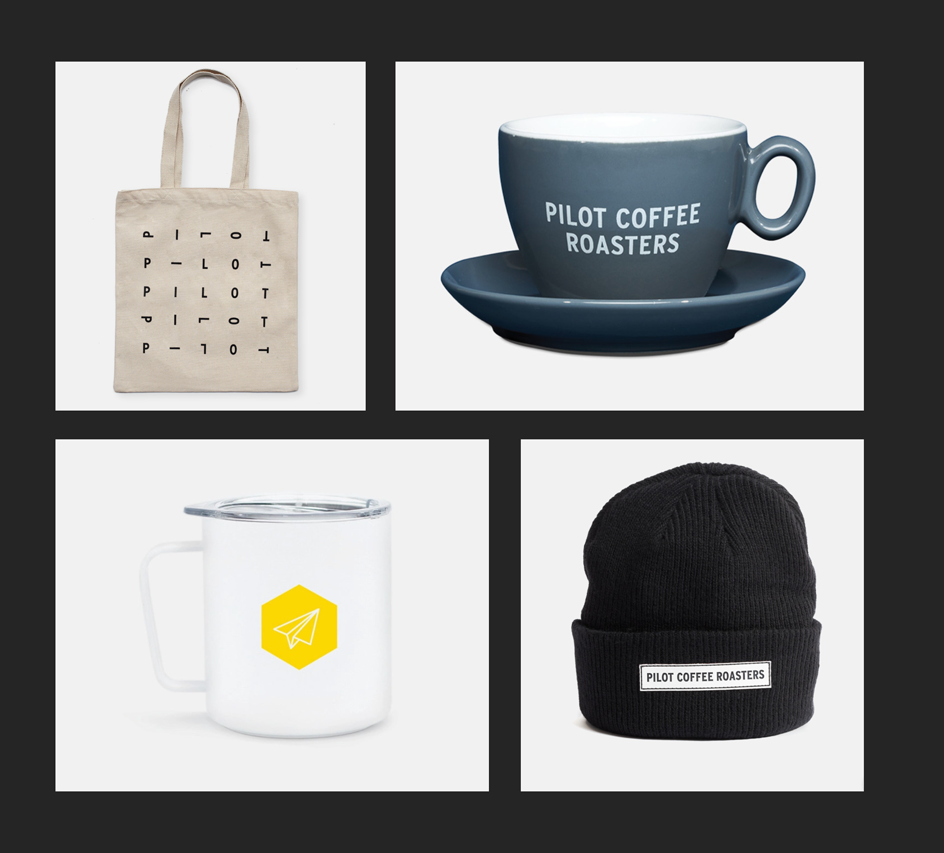
Packaging - Was not cohesive throughout collections which led it to look like each was made by a different company and you didn’t know where to look for information. On the other hand some collections weren’t well differentiated from each other, so it was difficult to tell what collection you were shopping
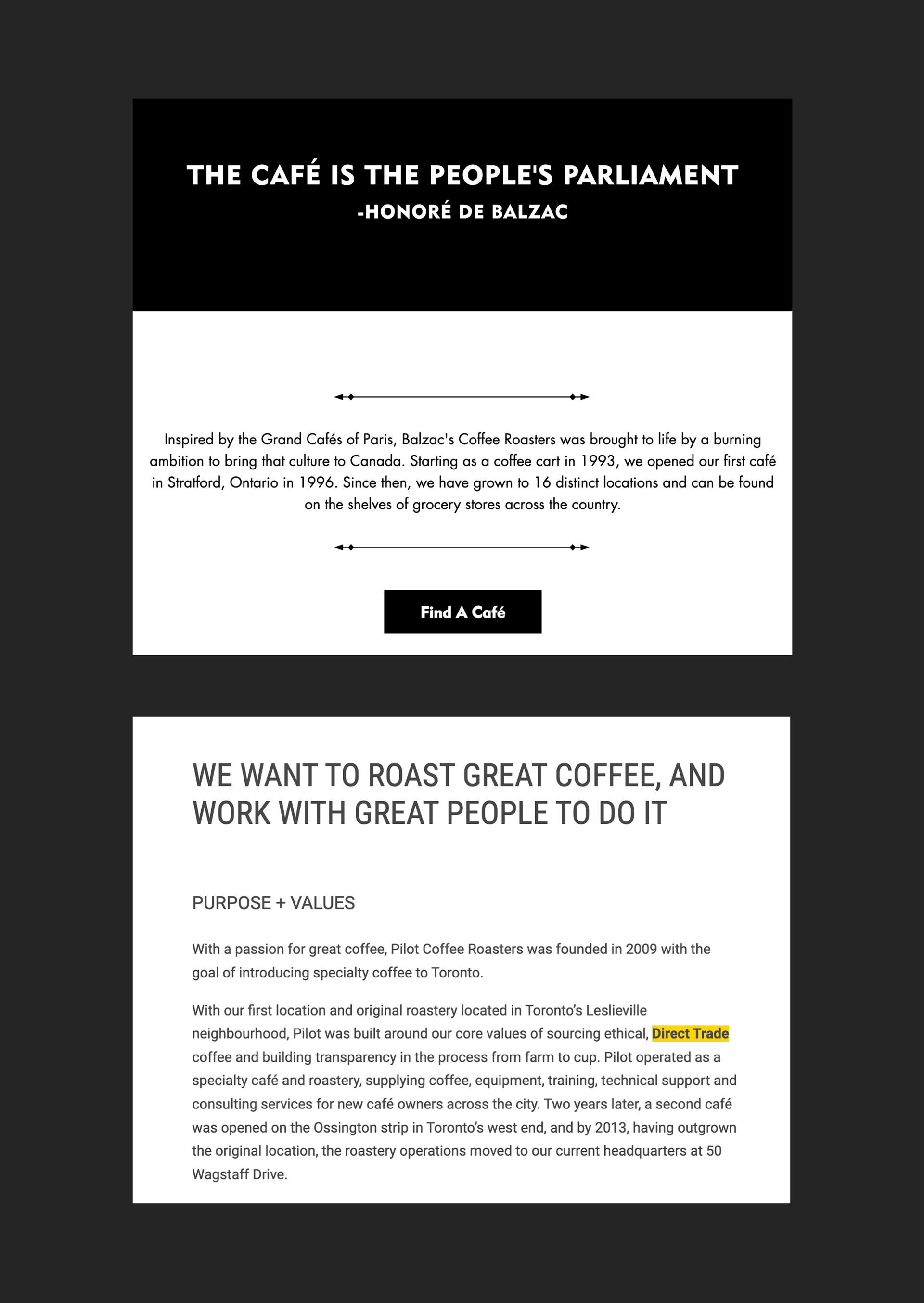
Competition Analysis: What is Working for Others?
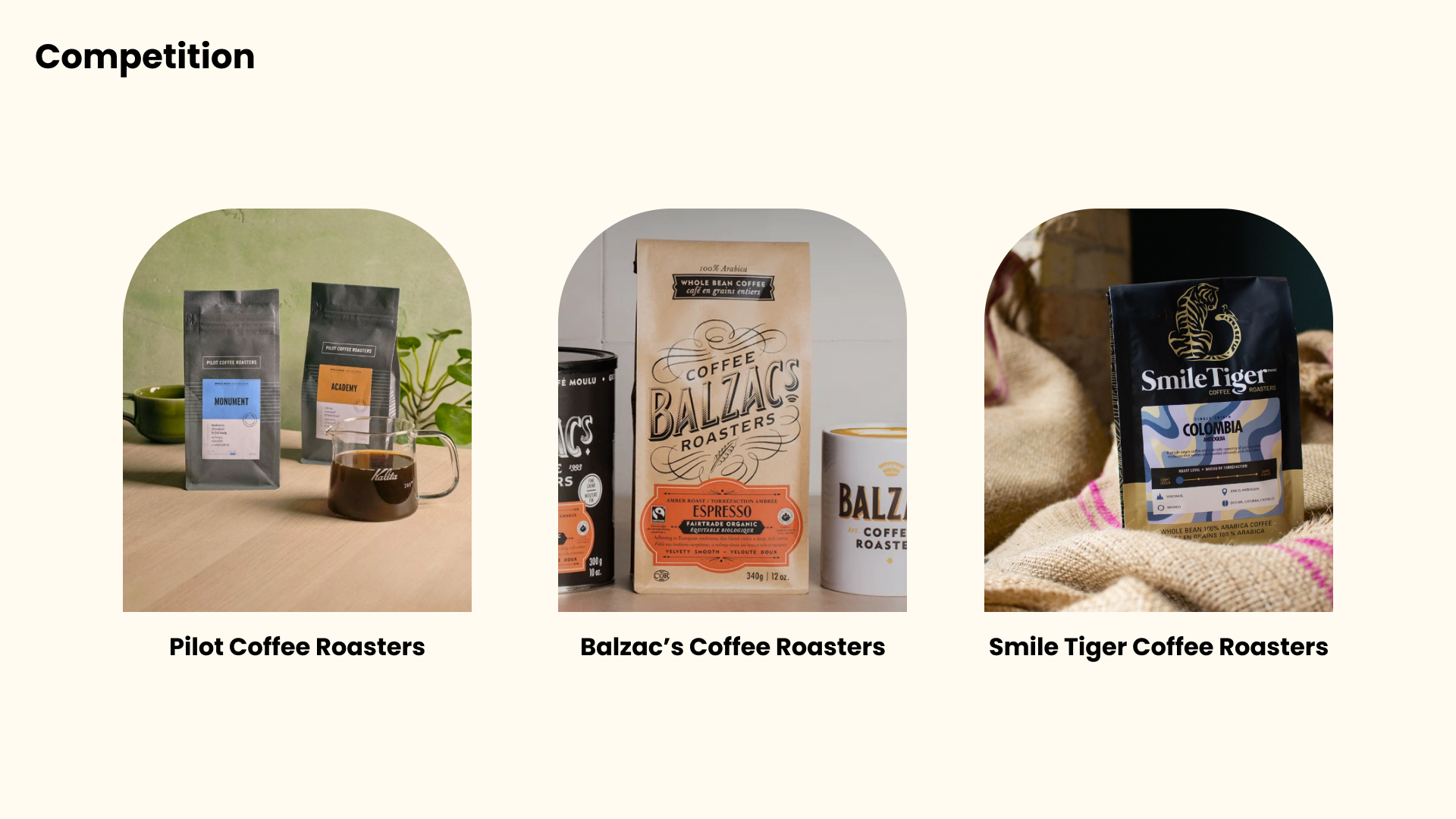
We analyzed their target demographic and audience which helped us decide our positioning in the market - Baden leads more affordable and everyday rather than a luxurious or artisanal.
We compared brand messaging and storytelling and found similarities such as fare trade, ethical, and sustainable.
We also did a critique of their branding to see what they were doing well and things they could improve. This step allowed us to pull inspiration on how Baden could be redesigned to be as strong as competitors with messaging/copy, packaging, and branding.
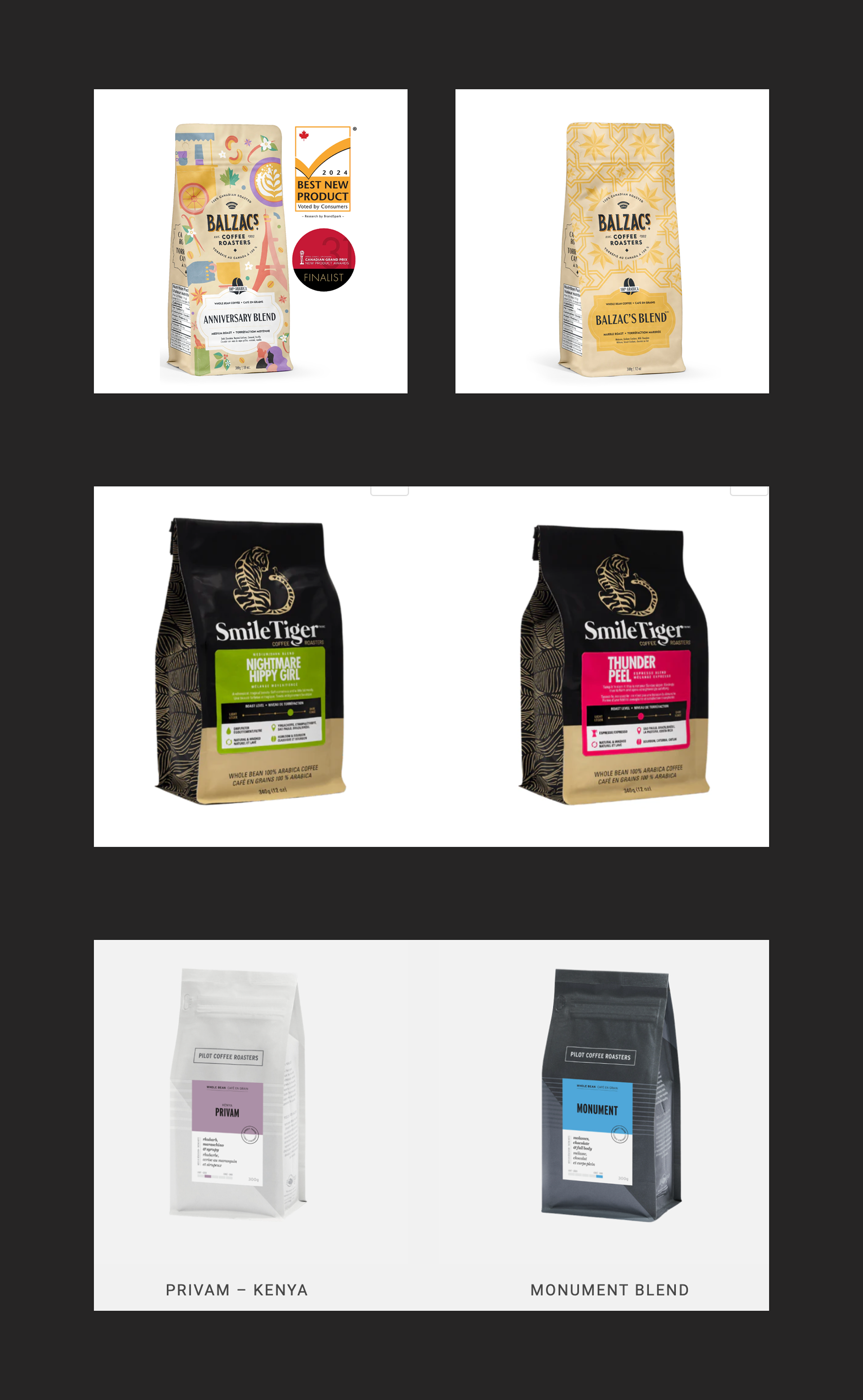
Finding 1 - Perfect Cohesion
They differentiated between blends and collections while remaining on brand and recognizable by keeping placement of elements the same, using brand colour and on-brand patterns.
Finding 2: Versatile Logo
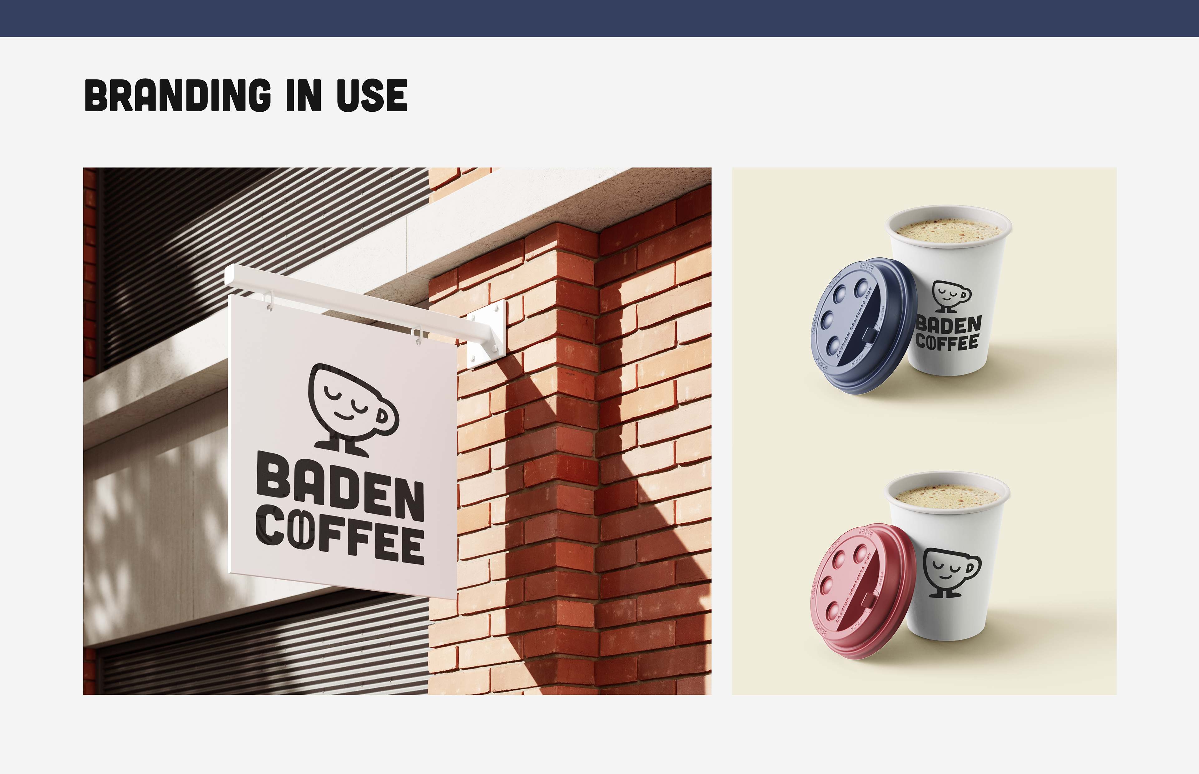
Logo sets that create versatility are essential because they allow legibility and recognition of the brand in different spaces and places.
Finding 3: Strong Brand Values & Story
Strong brand values and story paired with great copy creates a rich and exciting shopping experience and allows people to identify with the brand.
Brainstorming - Trial & Error
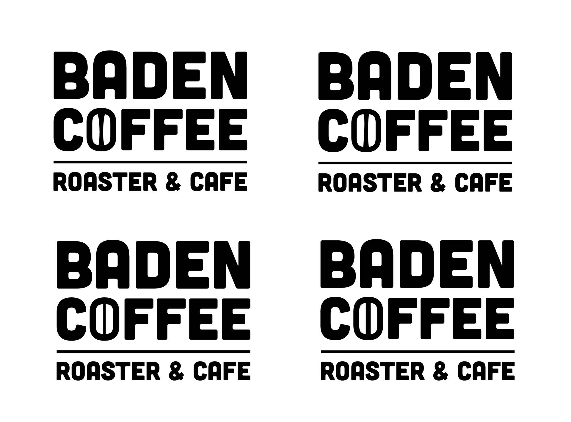
Playing with the logo
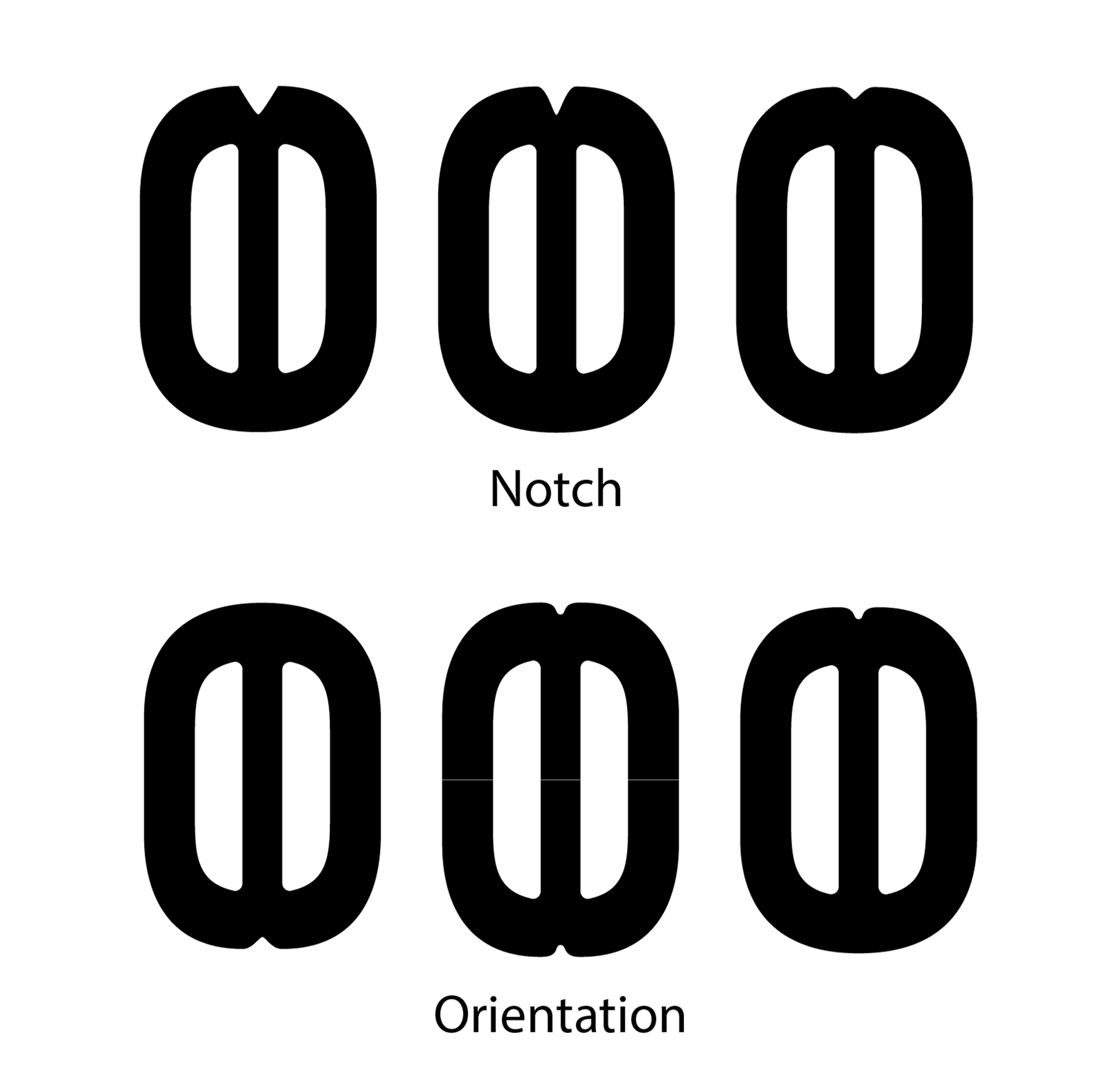
Although the notch in the bean is a small element that may be lost from far away the recognition of the bean was only an issue when the bean was standing alone or quite large. It was important that this element looked harmonious with the type and matches the bold serif with curves.
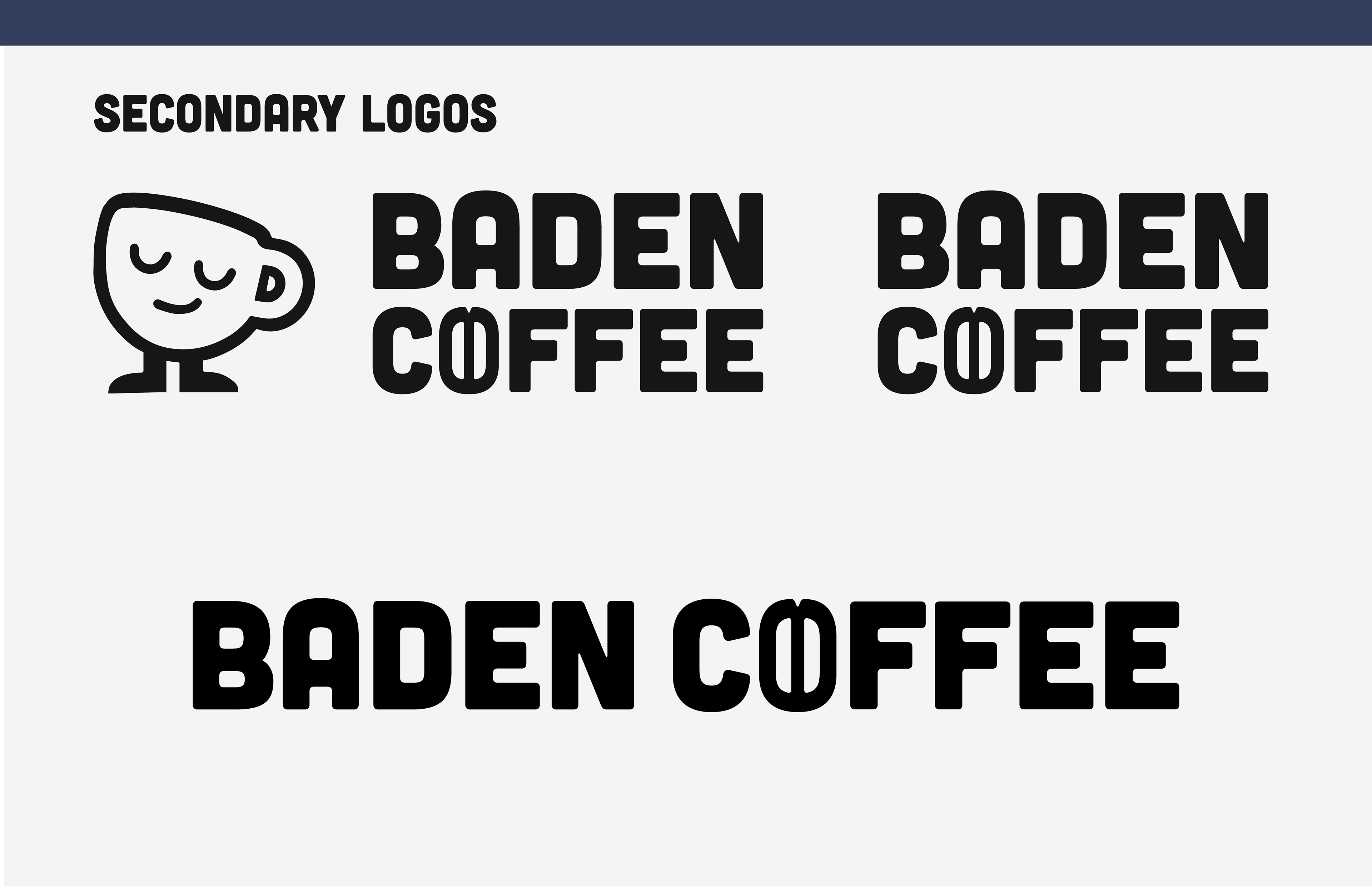
You’ll notice we got rid of the type underneath the mark, this was in mind of further expansion and it felt unessacry.
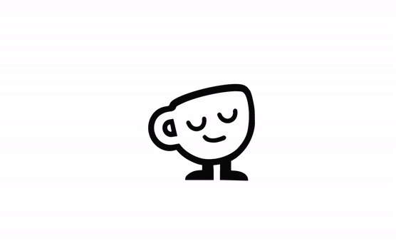
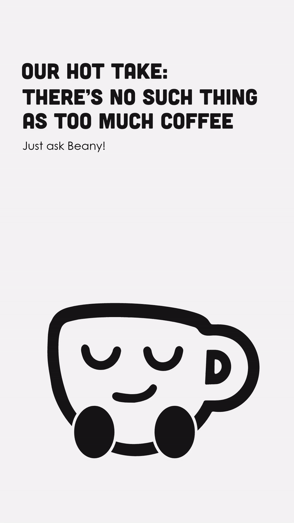
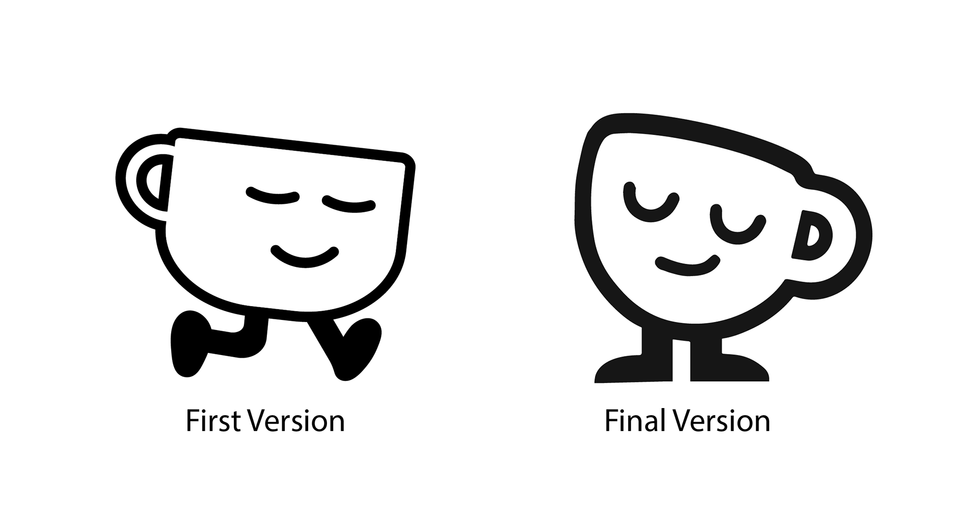
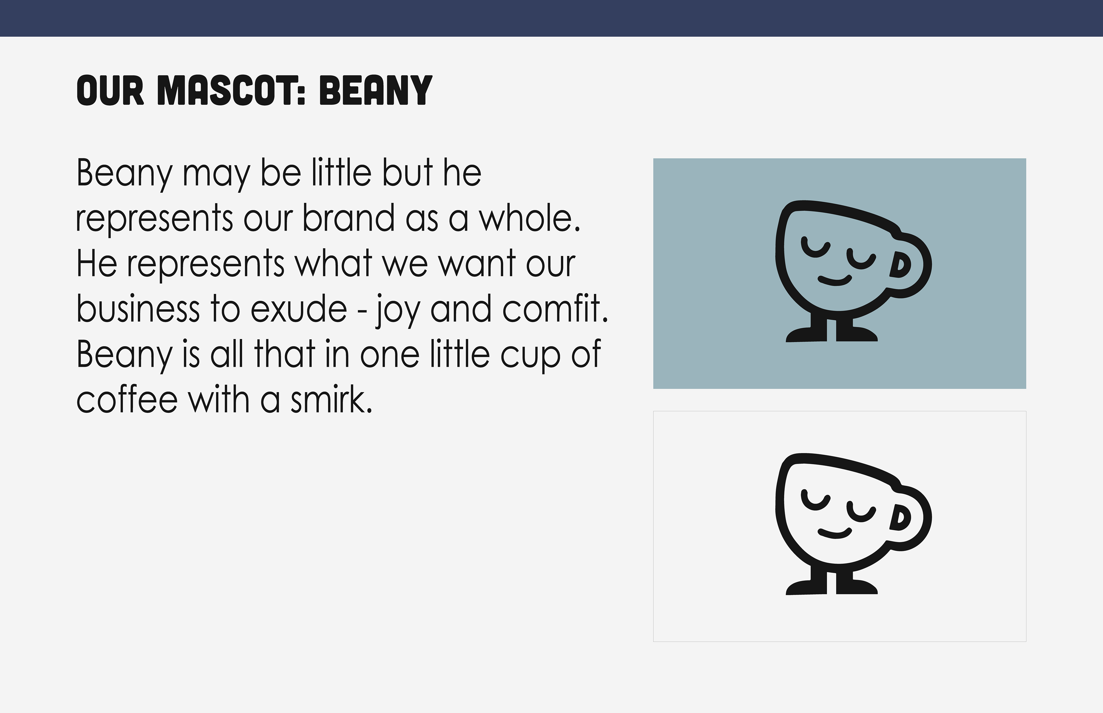
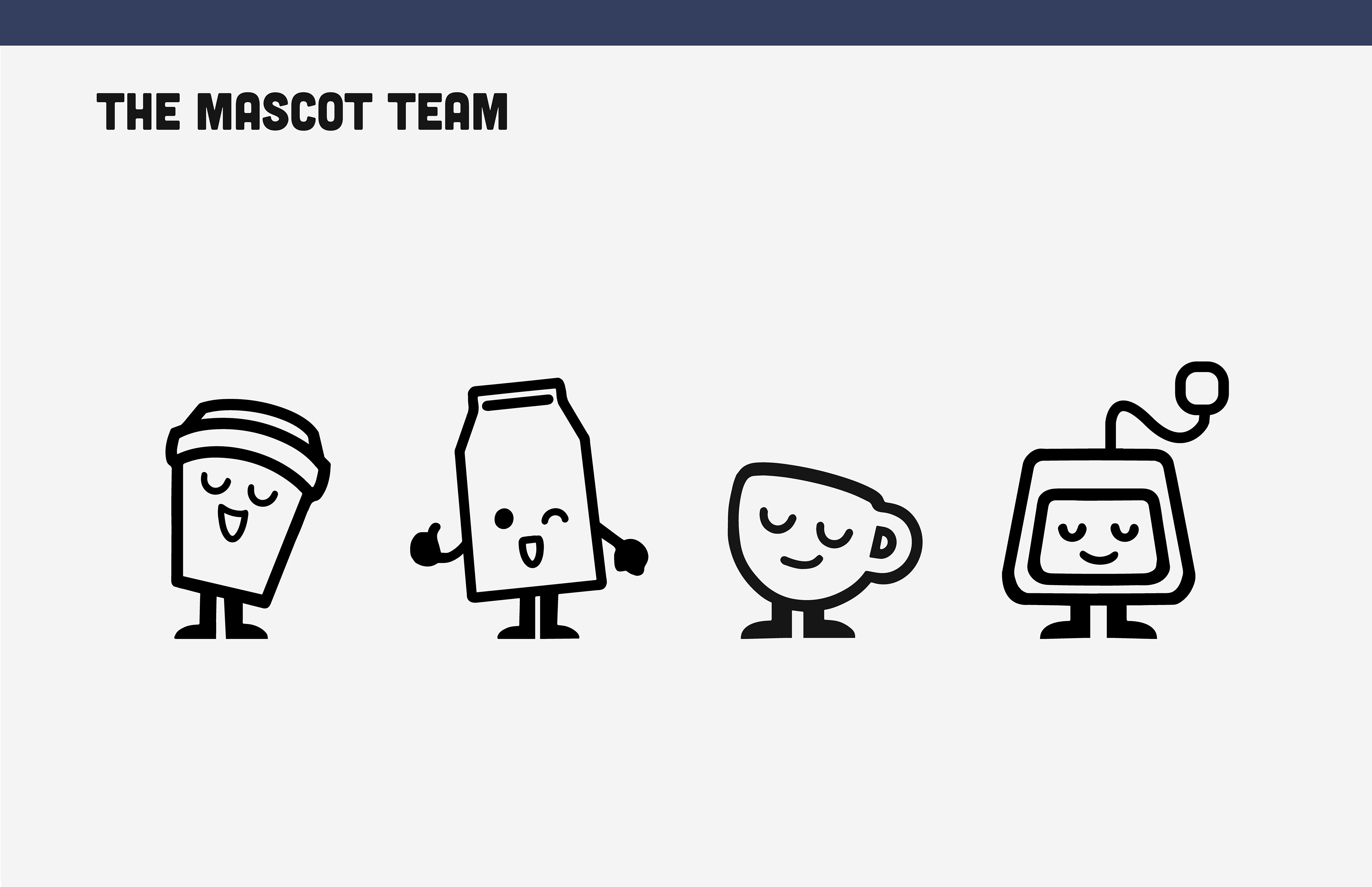
Progress on Beany The Mascot
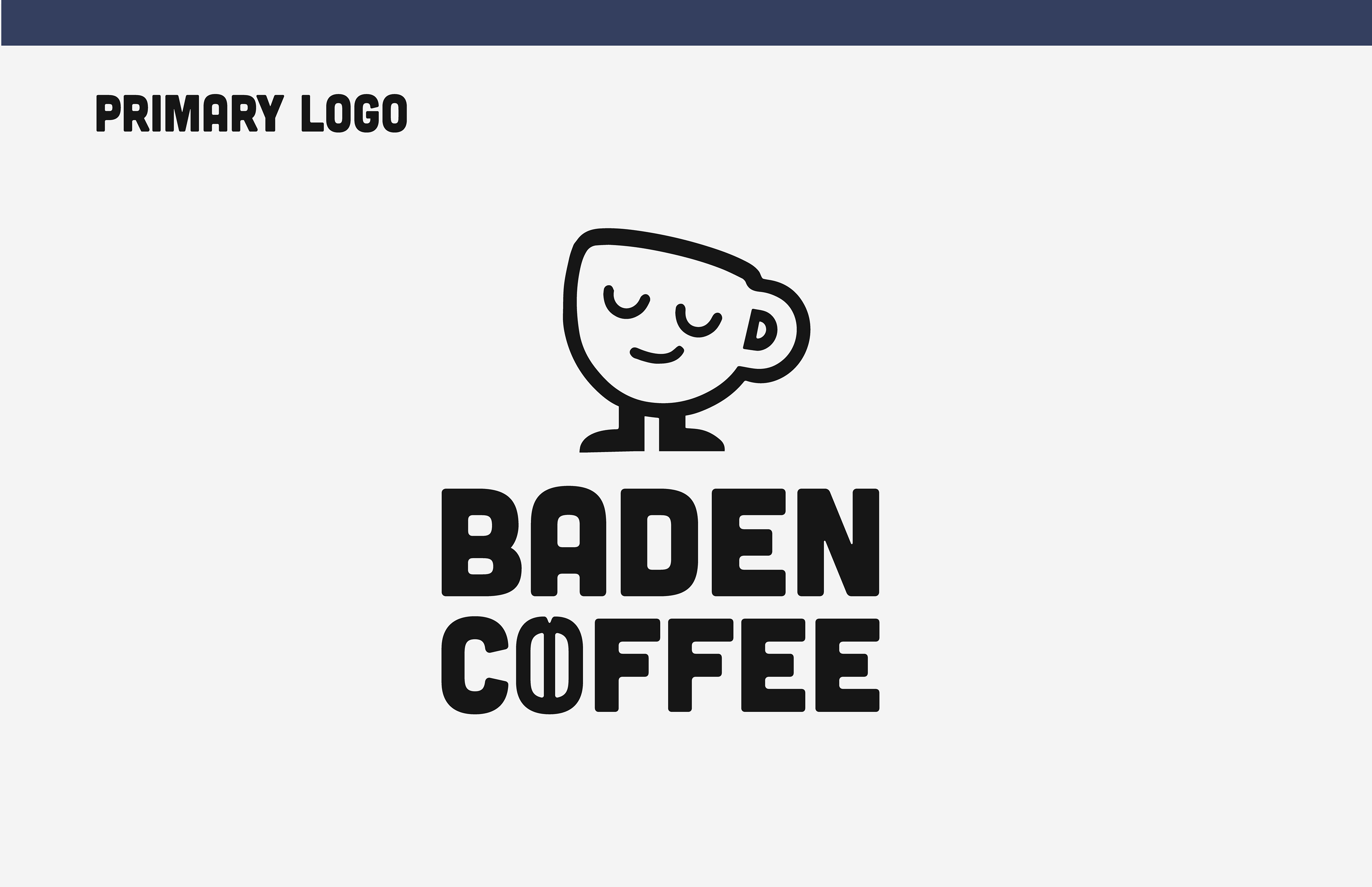
Final Designs - A Sneak Peek Into The Brand Guidelines
We chose to use a bold sans serif as it is eye-catching but also rounded making it friendly and welcoming. We replaced their current mascot with one that is more friendly and chill.
We chose to add a notch to our bean "O" because although it is a small detail and you usually wouldn't add that to a logo, it creates more recognition of the bean when the "O" is scaled or used as a mark.
We chose to mainly have a monochromatic colour palette to create that welcoming and calming feeling. We added in the colour raspberry to ensure we had a colour that would stand out for any important information and CTAs. We wanted a colourful palette so that the product stood out on shelves and to appeal to a younger audience.
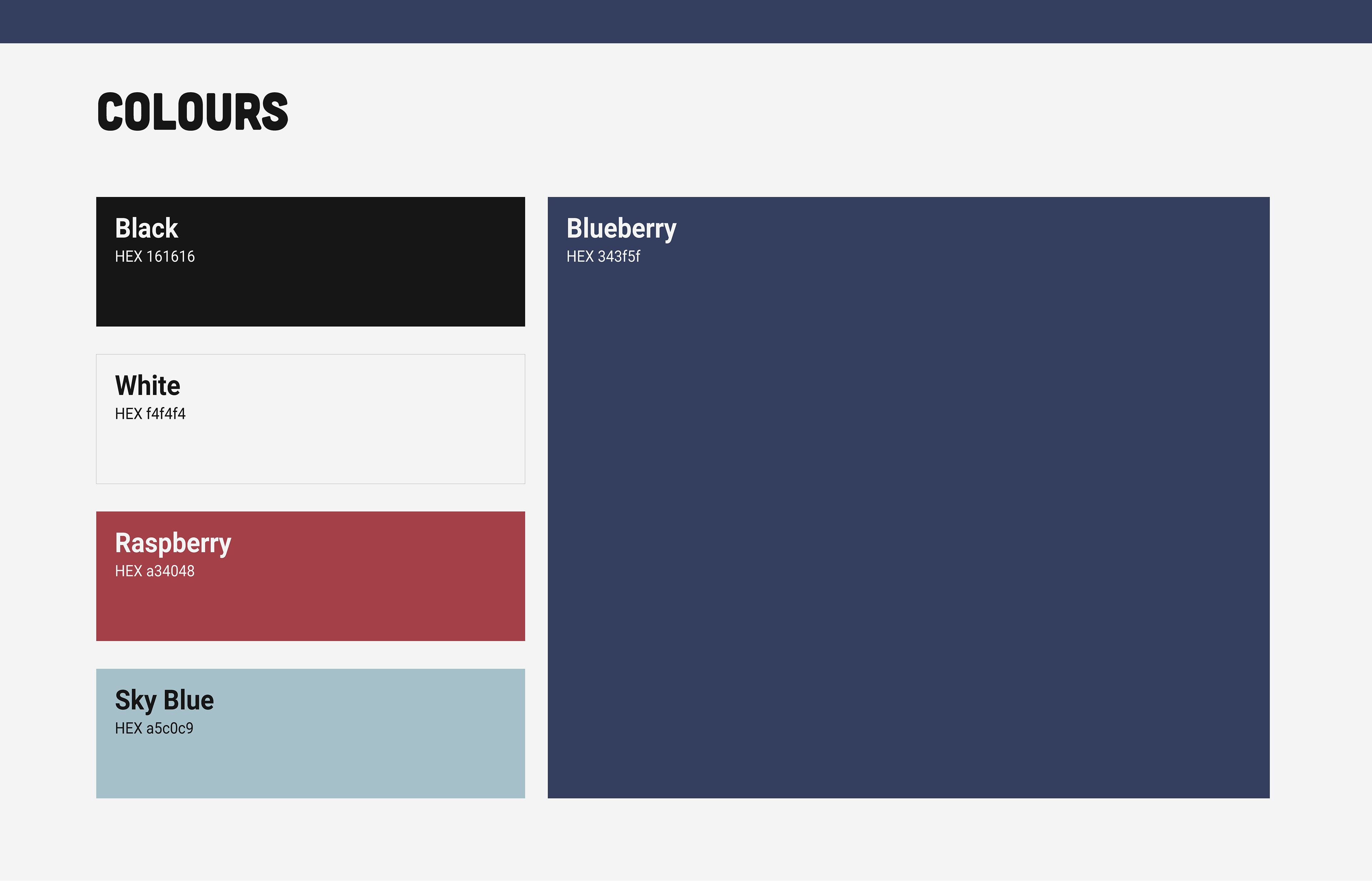
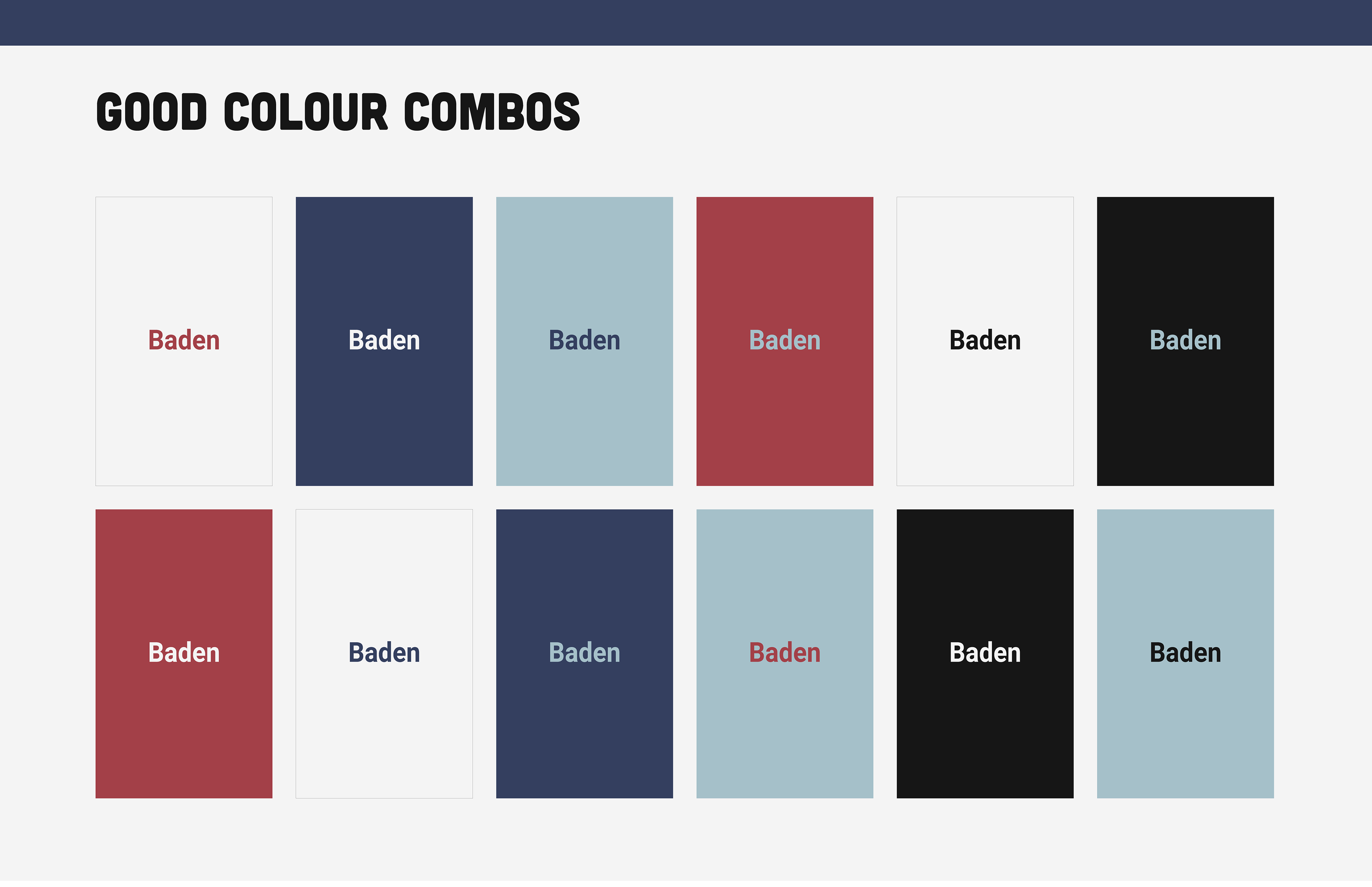
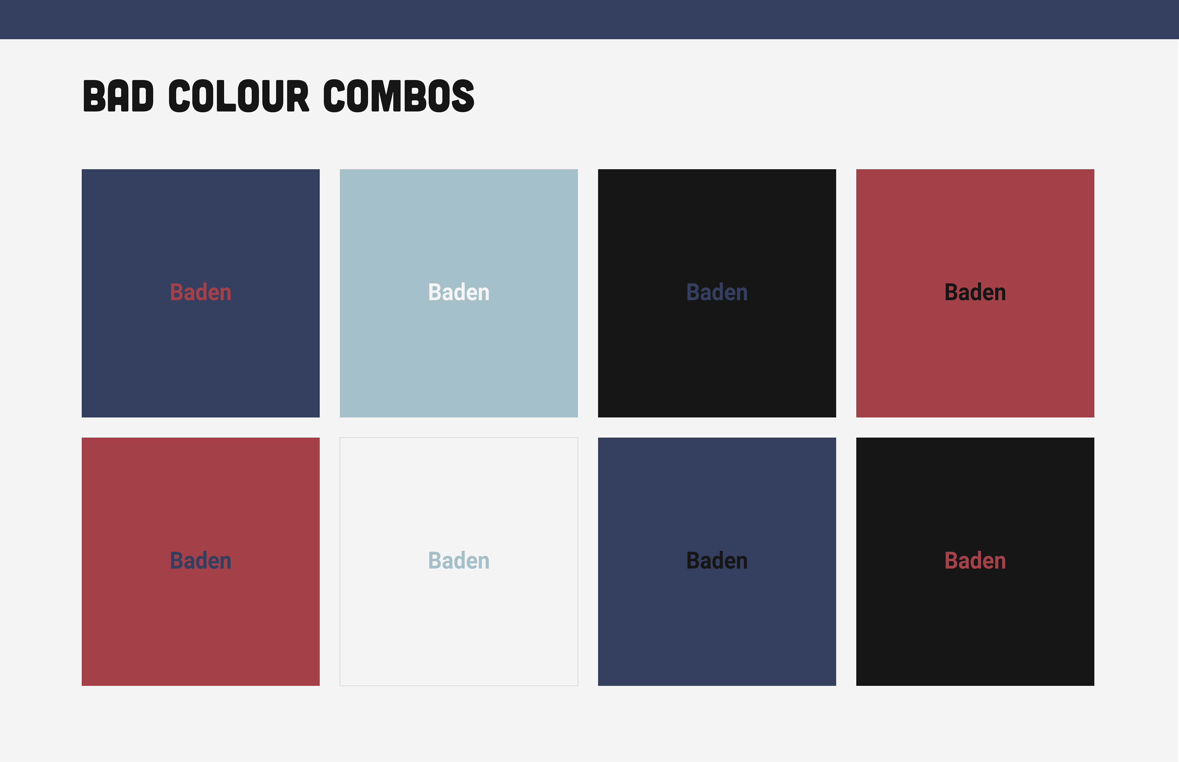
I always add in good and bad colour combnations to brand guidelines I create, because not everyone using it will be a designer with a deep understanding of accessbility and colour contrast.
Key Takeaways
What challenges did you face during your project?
Within the rebrand it was tough to decide whether to keep the current values and copy and base the brand off that with a refresh in their look or completely rework the branding and strategy in oder to shift to a new (and growing) audience. Ultimately we decided to completely redesign the brand from values/copy to packaging in order to holistically bring in a modern and youthful presence.
It was difficult to distill everything we were trying to portray and represent within the copy, Baden Coffee has such rich history and has many different pieces so it was all about finding wording that encompassed all that they represent
We knew we wanted to change the mascot from the start but the process of getting Beany perfect was challenging, we and my partner were stuck on the style we wanted to take on and the emotions we wanted it to portray. In the end i’m very proud of how Beany turned out and feel he represents the brand perfectly, along with his team