Role
This was a solo personal project.
Applications Used
Adobe Ilustrator
Timeline
1 month
Overview
I wanted to create a brand with visual elements that would allow me to stand out and reflect my values, design style, and process.
Goal: portray my identity as a designer as well as my work process
I love to create bold, colourful and clean line illustrations. I love using bold sans serifs, blocks of colour, and minimalstic layouts through my design work. I also love to sketch, work with hands, and test print throughout my design process. All of these things I love in design are portrayed throughout my brand.
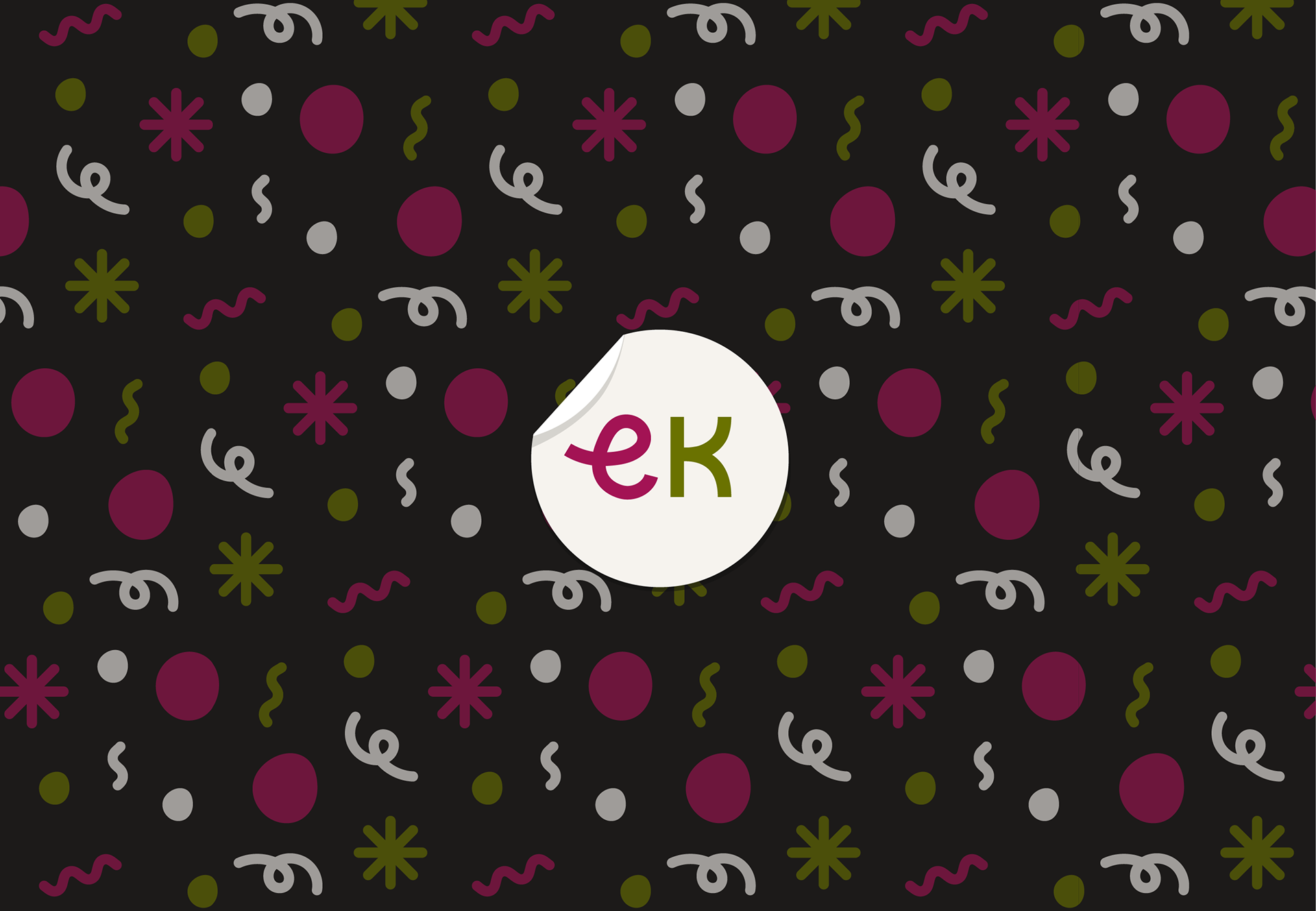
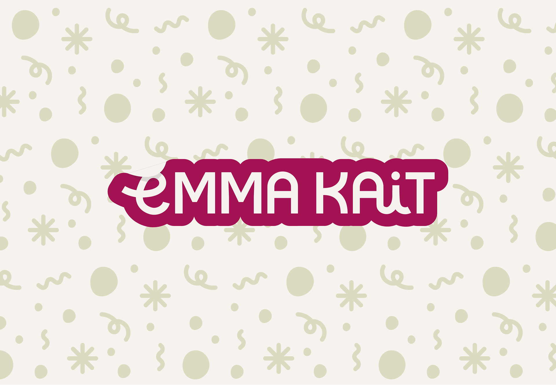
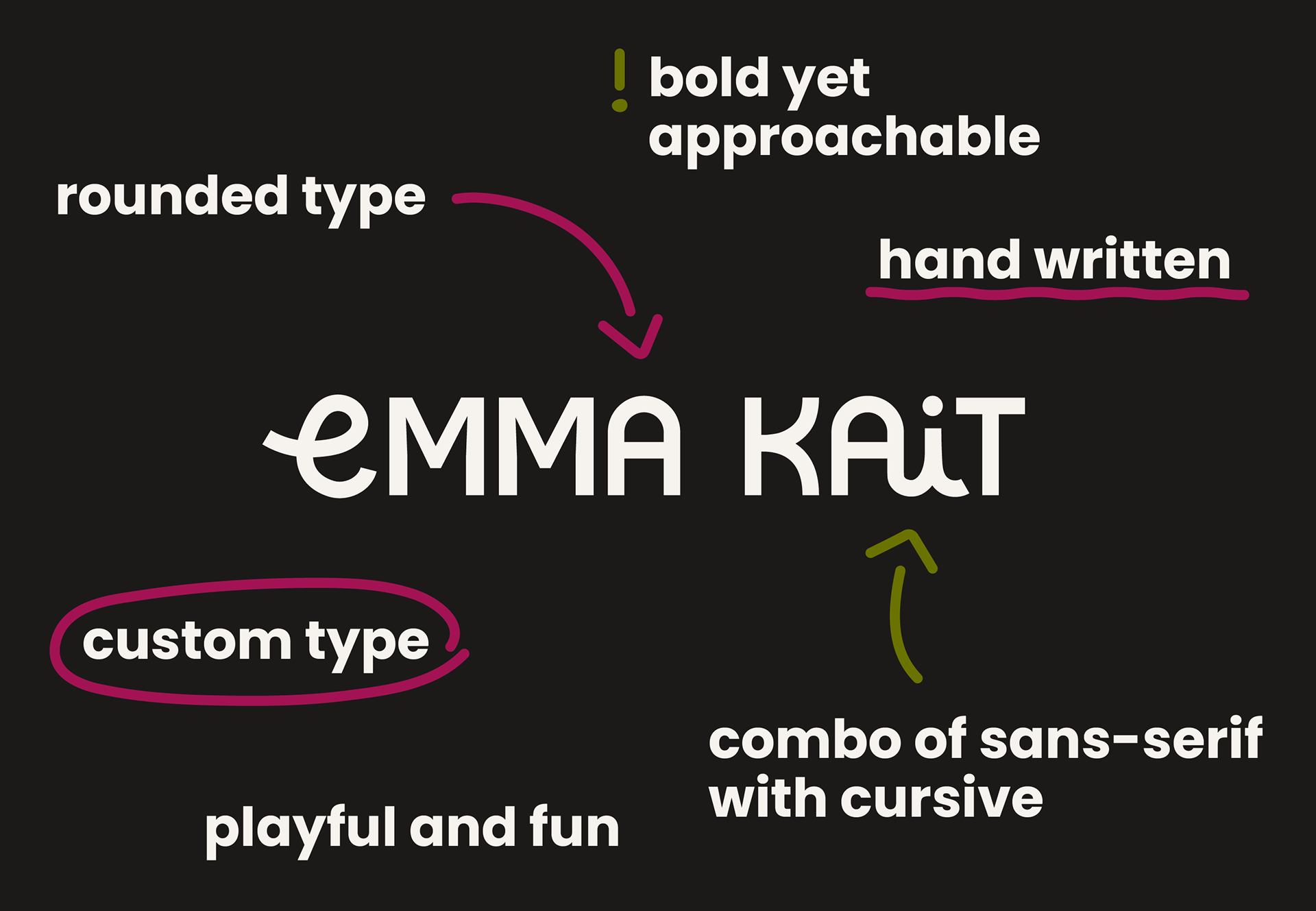
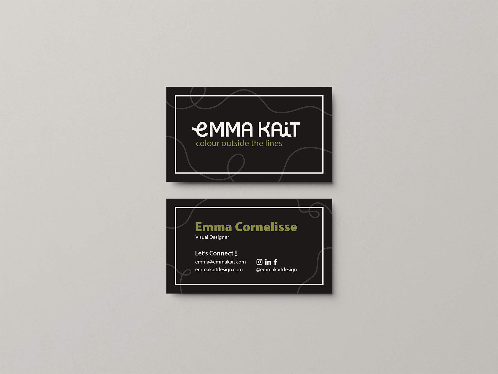
I created a completely custome type for my logo/word mark in order to create something unique that reflects me as a designers. I wanted the logo to be playful, approchable, and bold. I chose to do a mix of cursive as it give a handwritten feel alluding to my background in fine arts and my love for sketching in the design process.
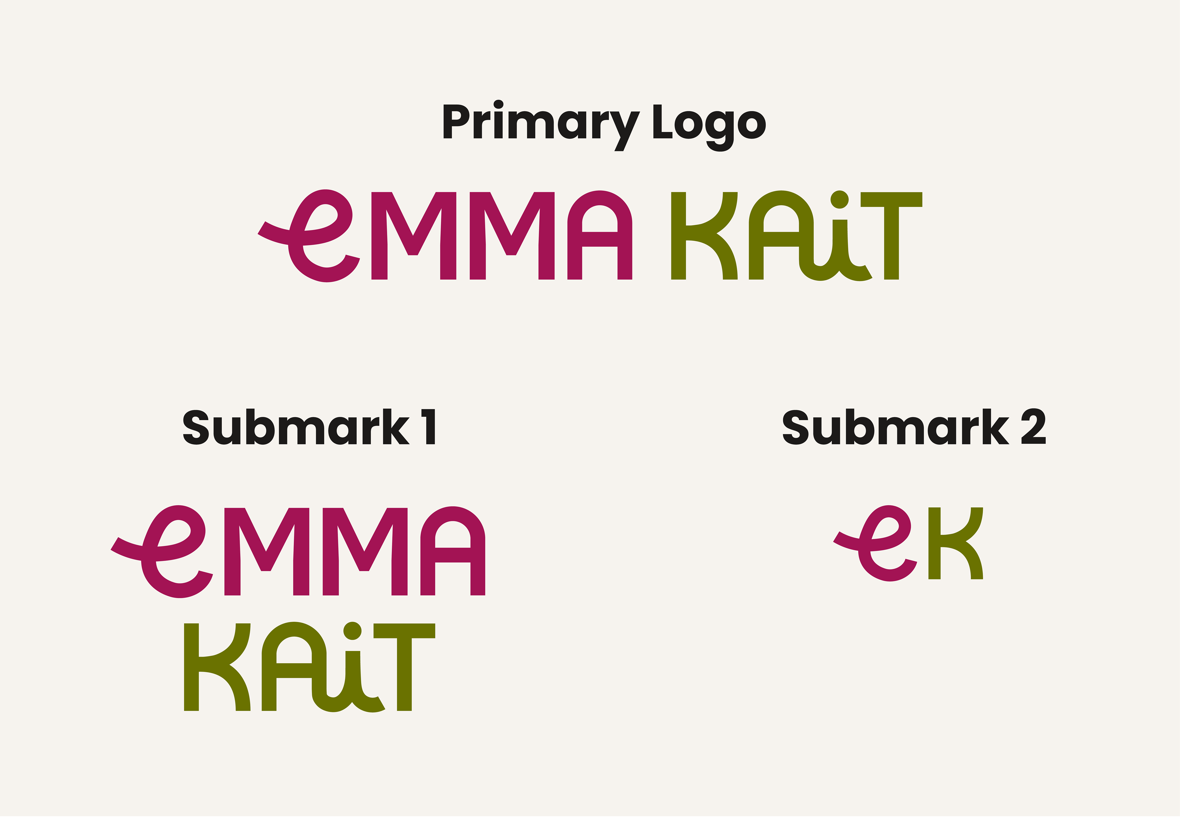
This set of logos/marks allows flexibility throughout different scenarios while maintaing brand recognition
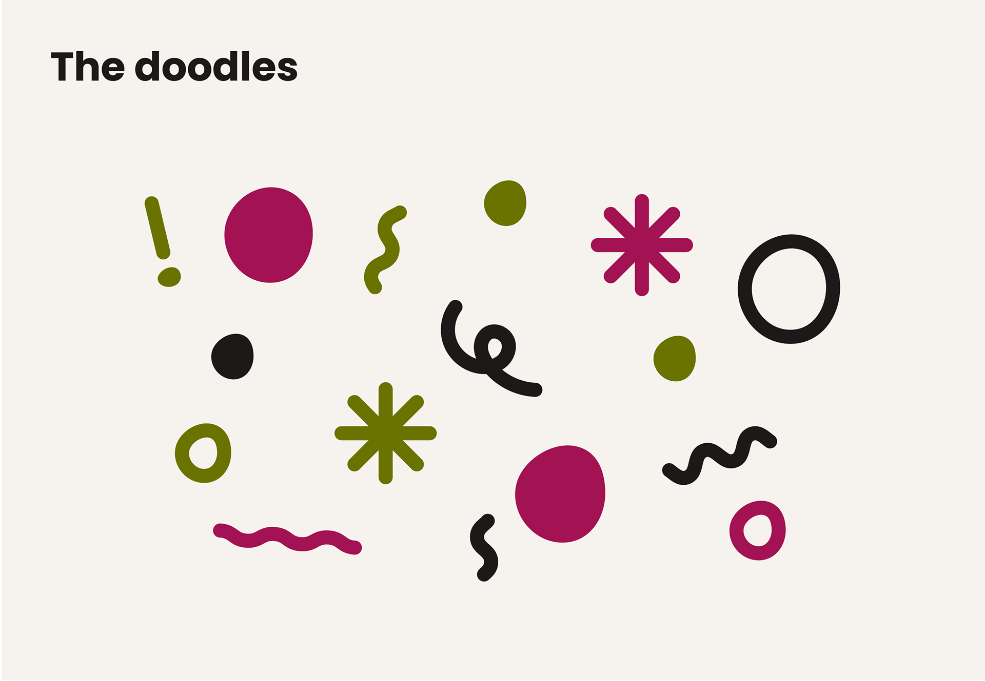
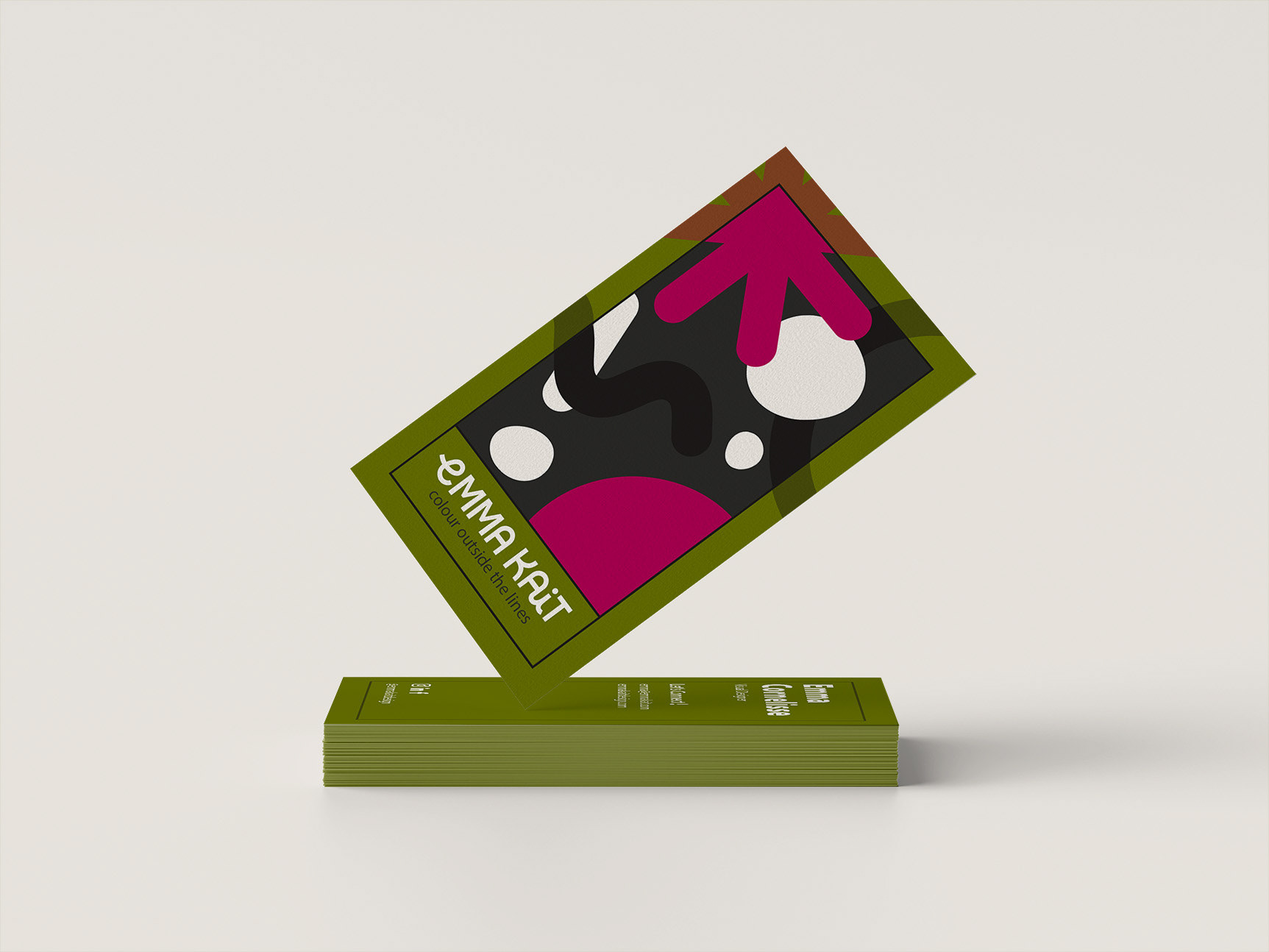
I created this set of doodles to be used as flexible brand elements for example, combined together tehy create a unique patterns and alone they can become bullet points.
I chose this fun illustrative style which still maintans clean sharp lines to pair well with the handwritten and cursive wordmark. This again plays into my love for tradition arts as well as my love for digital illustraion and the playfull feel I wanted this brand to excude.
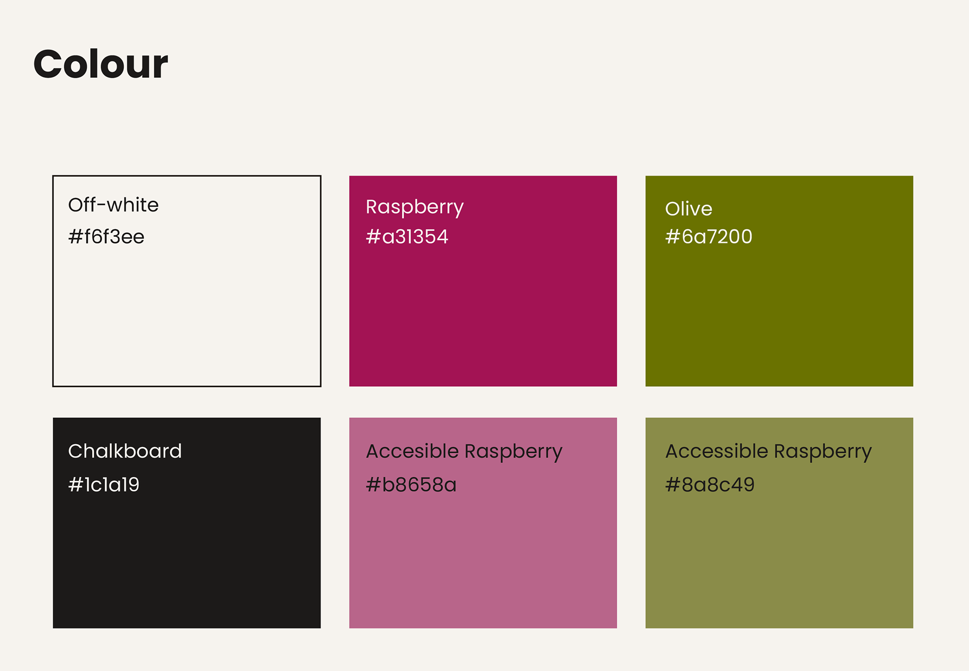
I chose warm colours as they are inviting which leads to a welcoming feeling.
I specifically chose a charcoal colour which I label "Chalboard", to tie in the idea of writting and working with your hands that I have sprinkled throughout the brand.
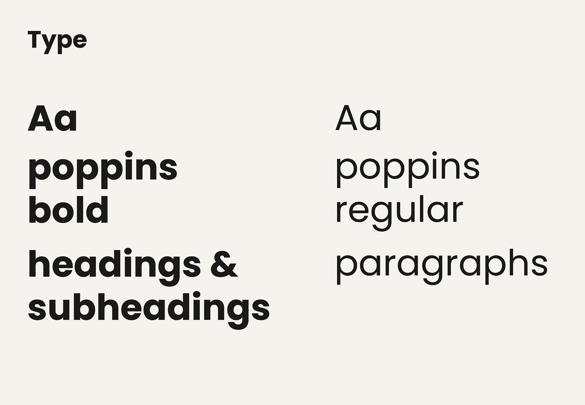
I chose a type that compliments the round elements of the word mark along with the bold clean lines. Poppins is also a highly legible font so it is very versistle, working well for long paragraphs as well as big, bold headings.
What I learned an key takeaways
Add in messaging and copy
Although I am only one person managing my personal brand, It would have been so helpful to add in key messaging, a brand story, and a tag line to th visual guideline in order to keep communications consistent. It is very important to maintan a consistent brand for recognizability and audience understanding. Adding this in would have allowed me to maintan a standard voice across chanels.
The importance of optical alignment
Since, I made the type from scratch and customized, I learned a lot about optical alignment and the the tricks our eyes play on us. When creating the letters I had to play a lot with kerning/tracking and adjusting curves over the baseline to ensure the word mark remianed balanced. Although it took a lot of effort to make the logo look balanced because of the mix of cursive and sans-serif it was incredibly worth it.